Rather Sway is a display font based on the bold sans serif lettering from the 1907 sheet music cover I’d Rather Twostep than Waltz, Bill!, illustrated by André De Takacs.
I designed the remaining uppercase, all lowercase, and more, with 305 glyphs in all, supporting 40+ languages. It carries forward the eccentric charm of early 20th-century popular culture, when hand-drawn type was crafted to grab attention. The letterforms are tall and condensed, with sturdy verticals and a rhythm that feels like they were painted by hand. Imperfect angles and quirky curves give it a distinct human feel. It’s a reminder that letters carry movement; they’d rather sway.
Rather Sway thrives in headlines, packaging, and signage where personality is required and catching eyes is a must. It balances vintage warmth with modern utility, giving designers a voice that’s playfully alive, industrial, and shouts... “Dance with me then!”
Your purchase is good for a single-user desktop license for both personal and commercial use across print and digital projects.

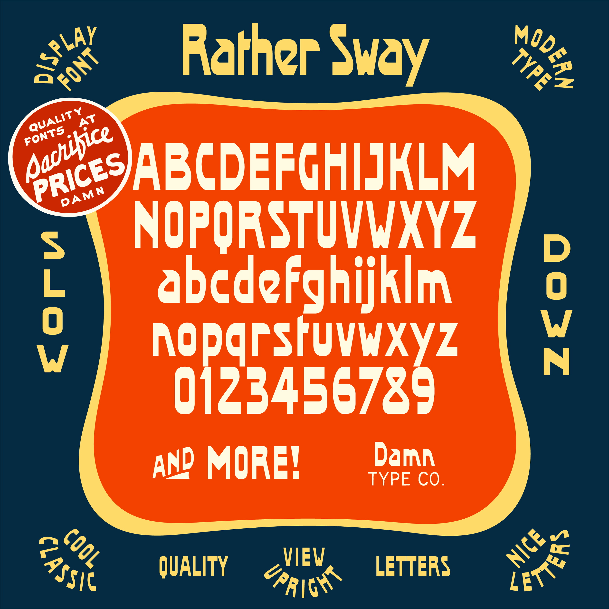 Image 1 of 16
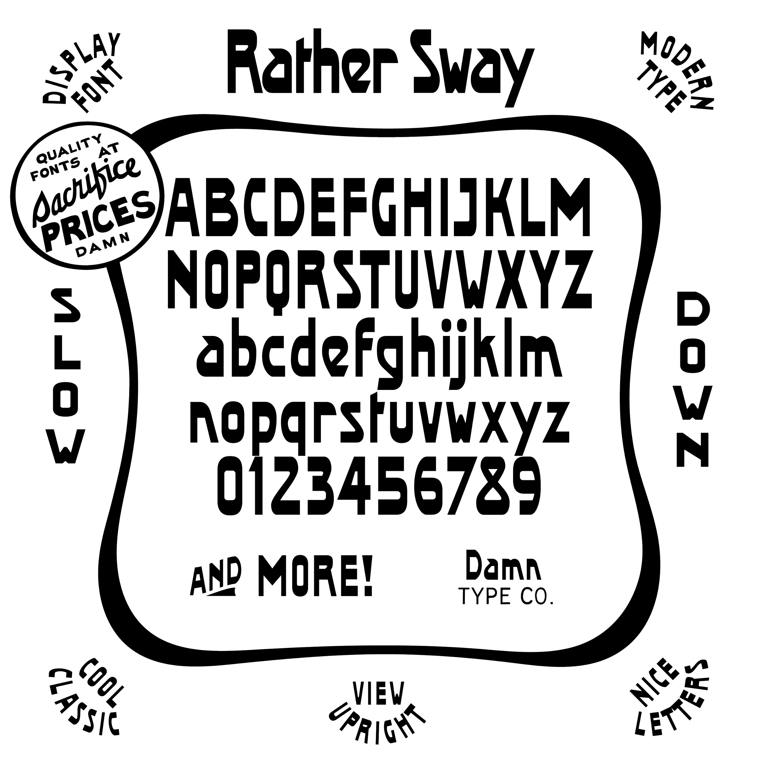 Image 2 of 16
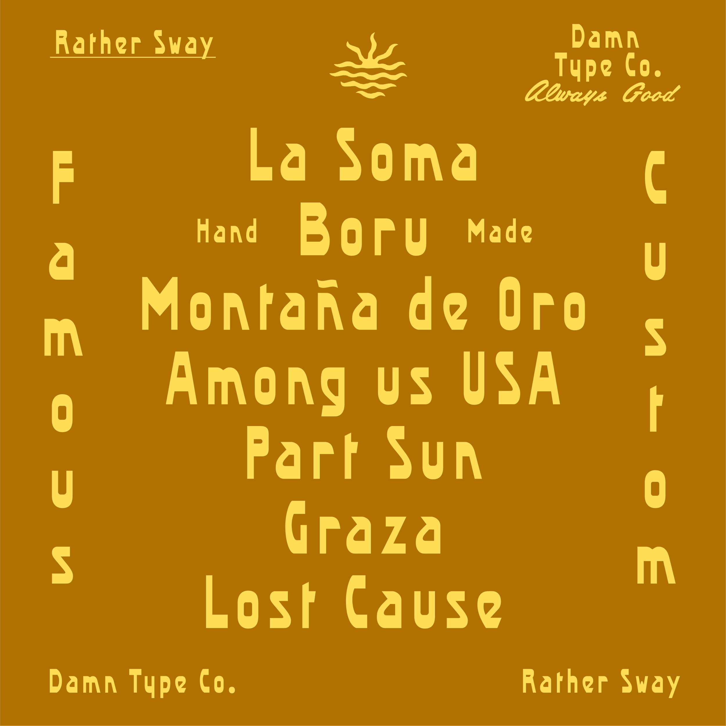 Image 3 of 16
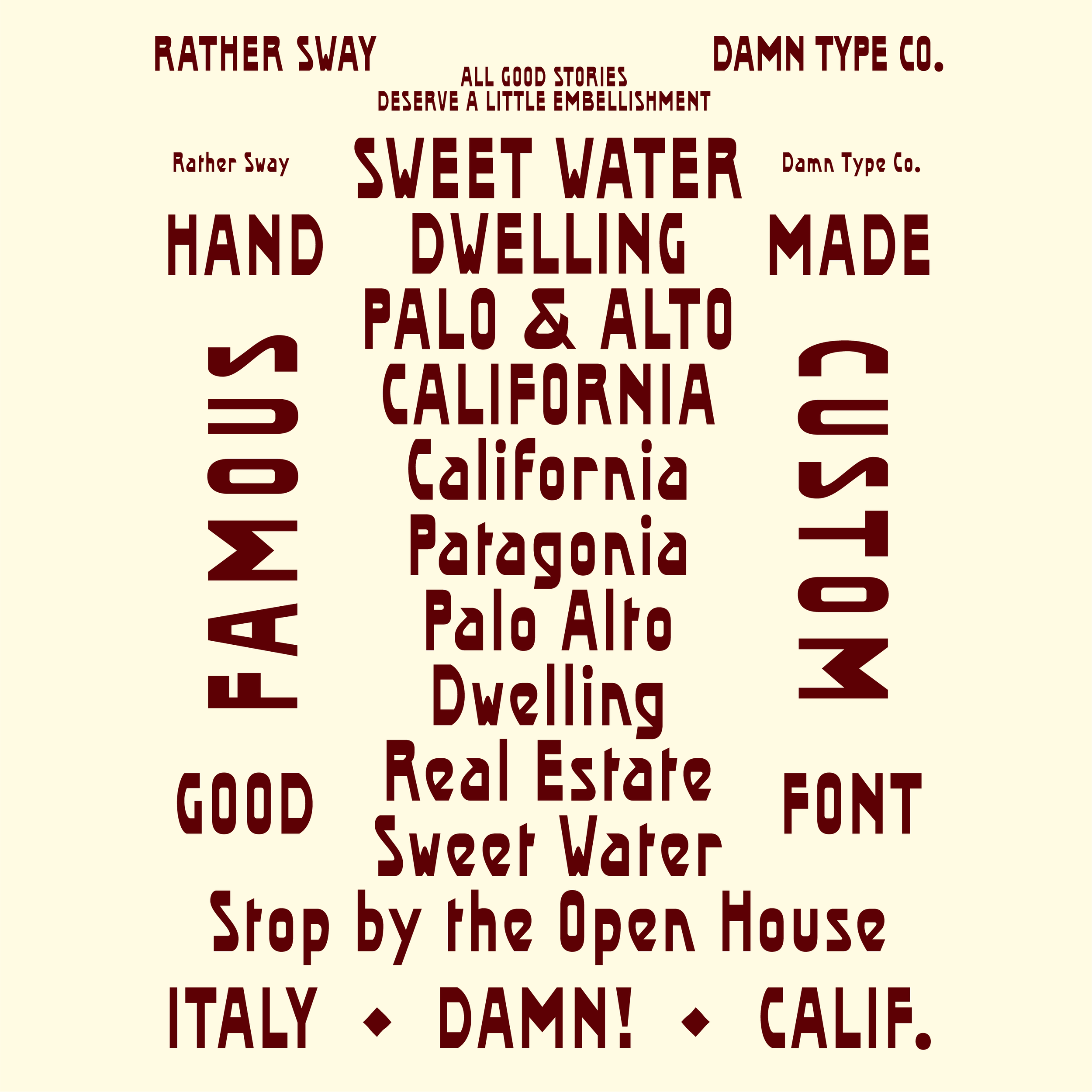 Image 4 of 16
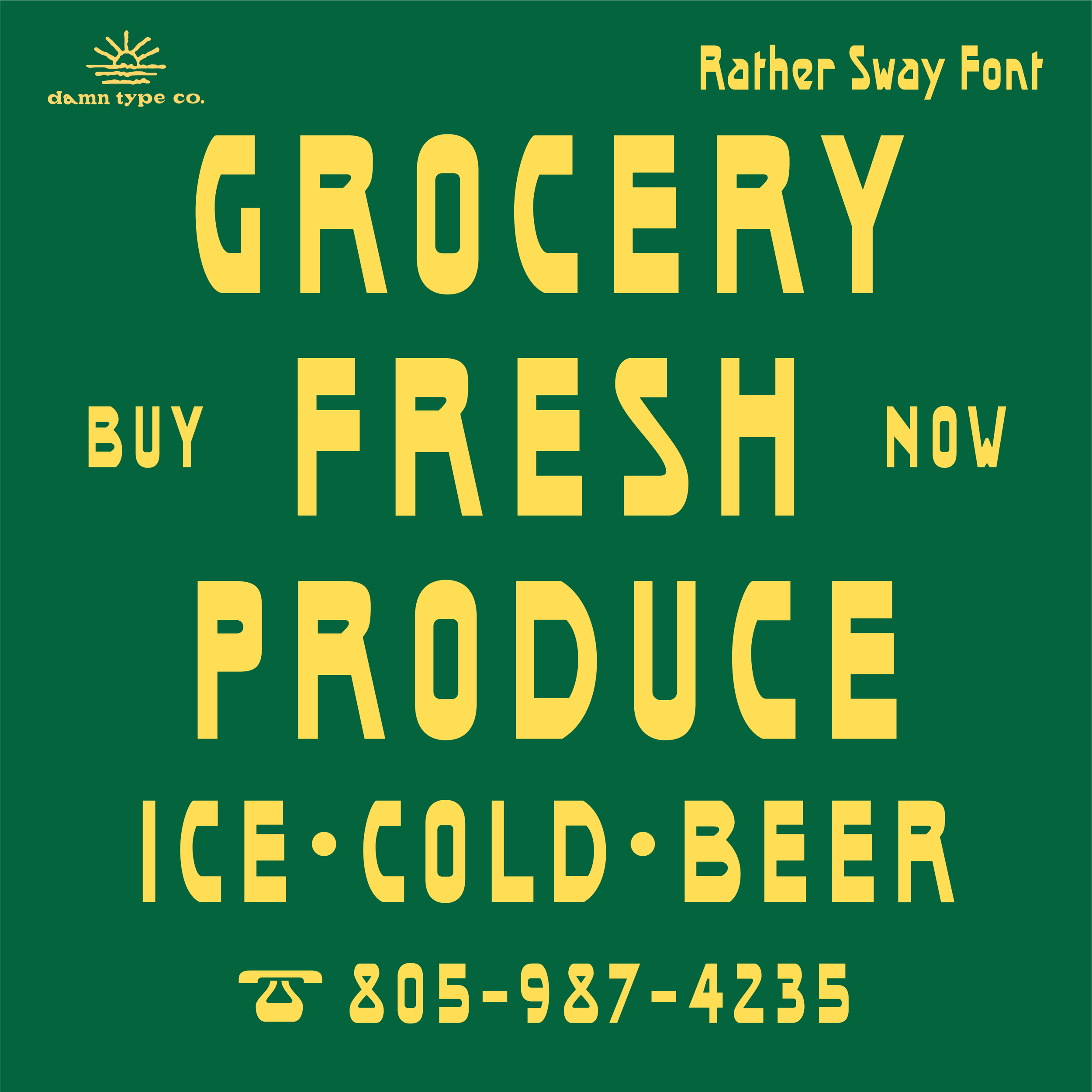 Image 5 of 16
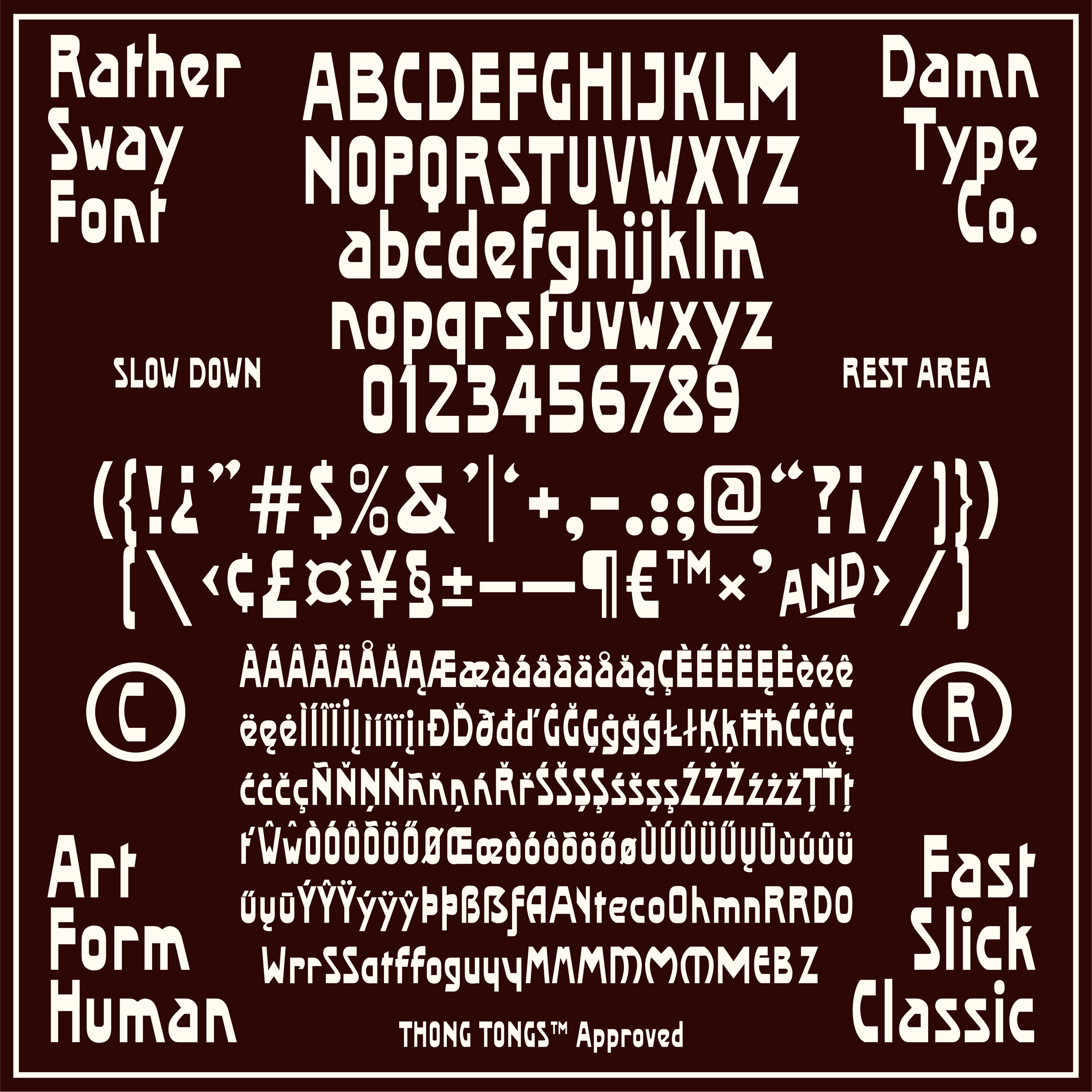 Image 6 of 16
 Image 7 of 16
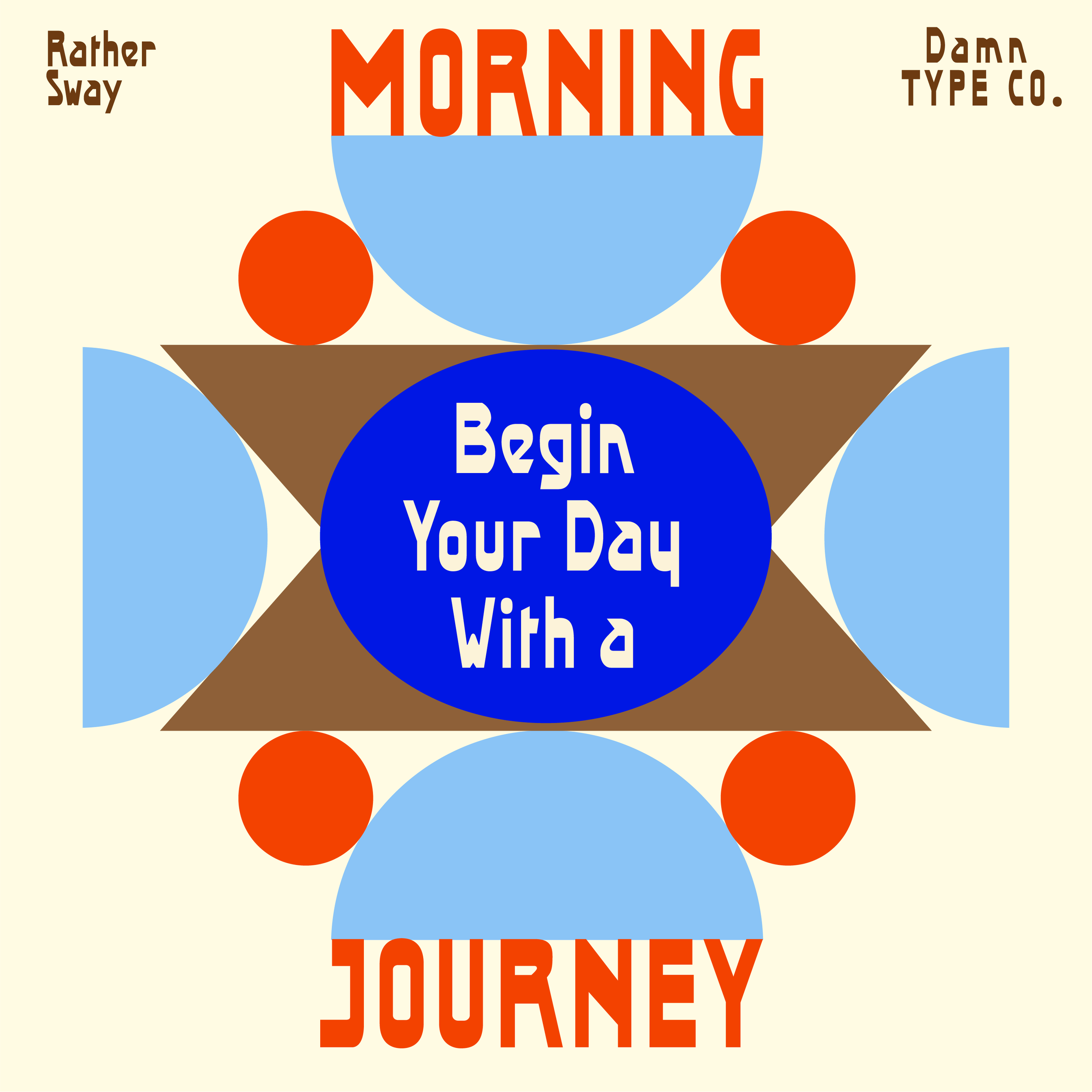 Image 8 of 16
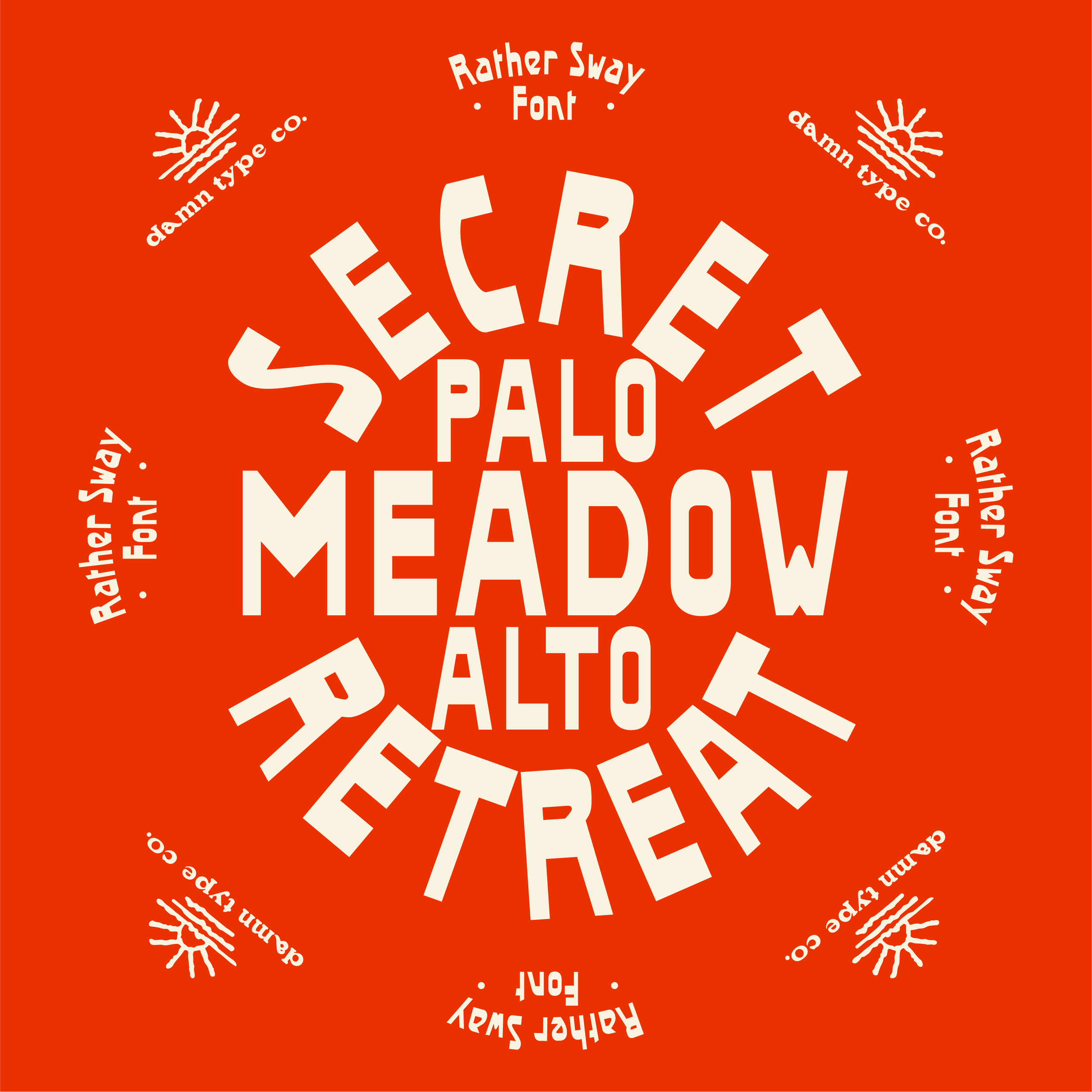 Image 9 of 16
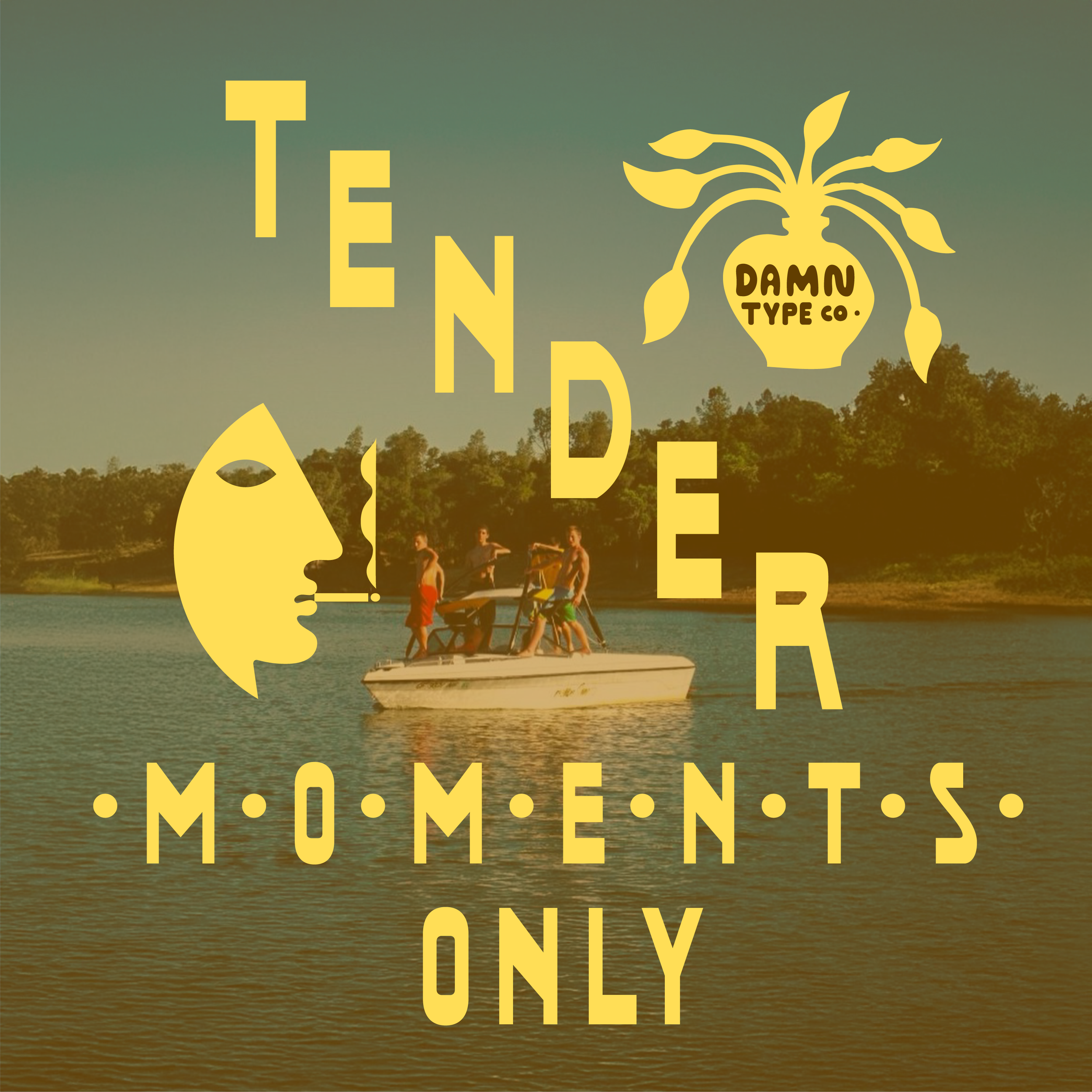 Image 10 of 16
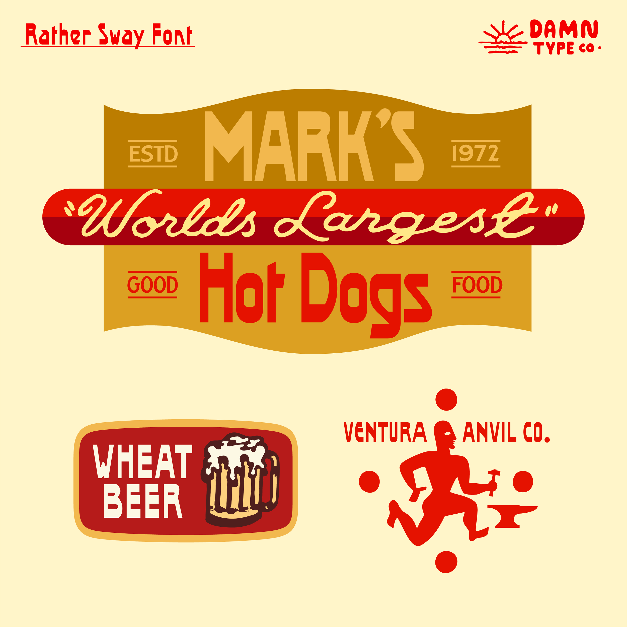 Image 11 of 16
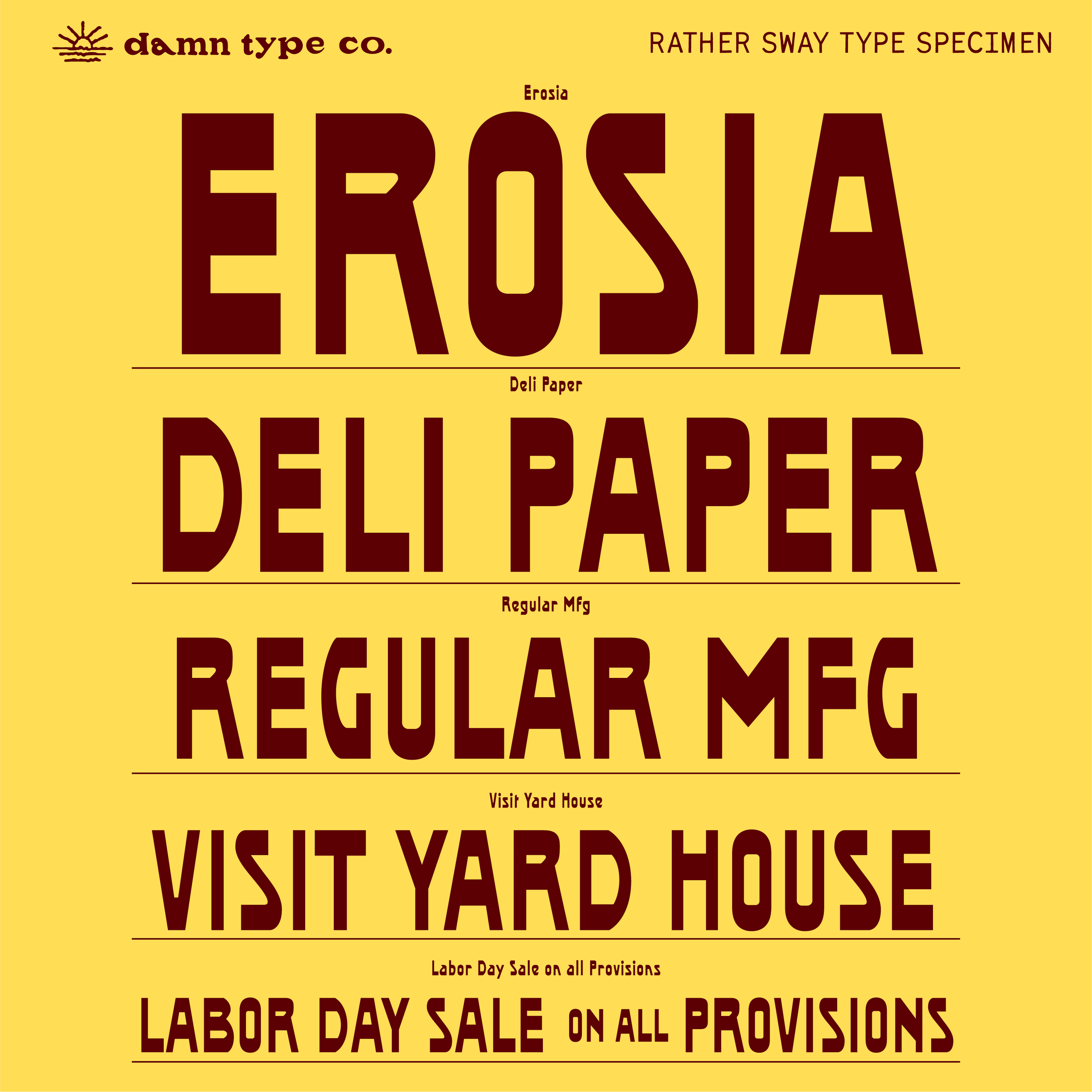 Image 12 of 16
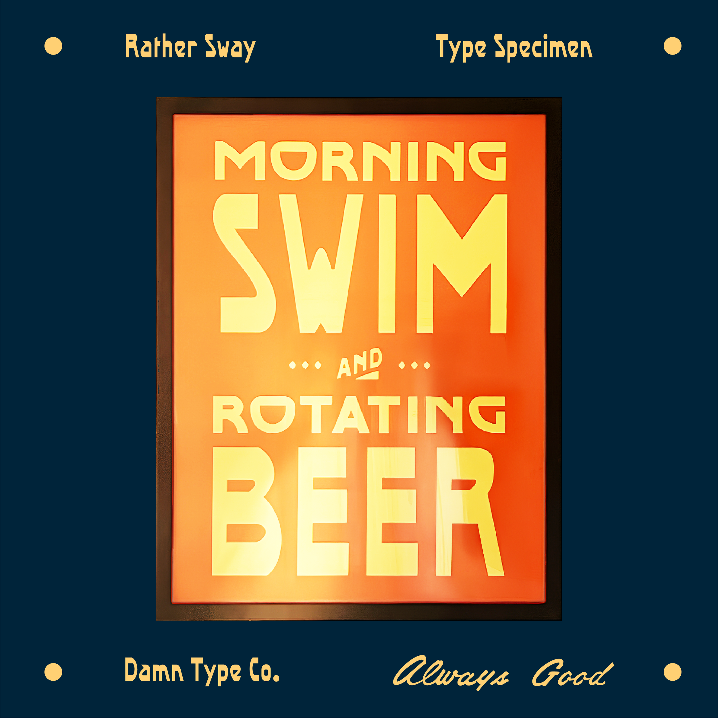 Image 13 of 16
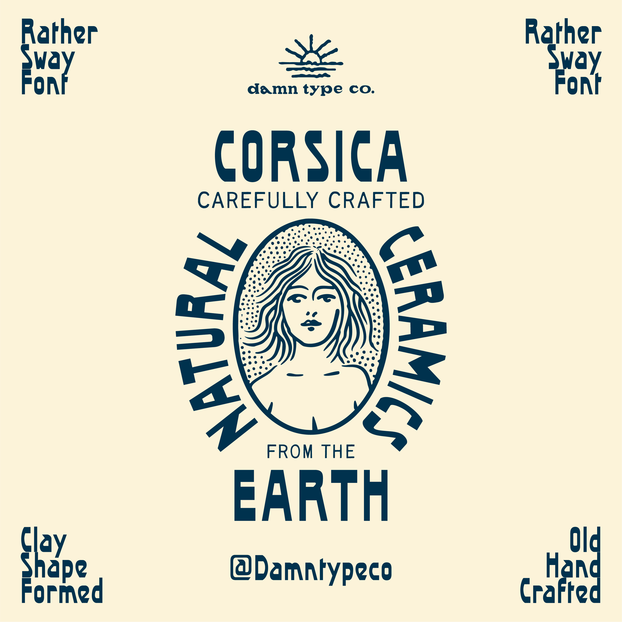 Image 14 of 16
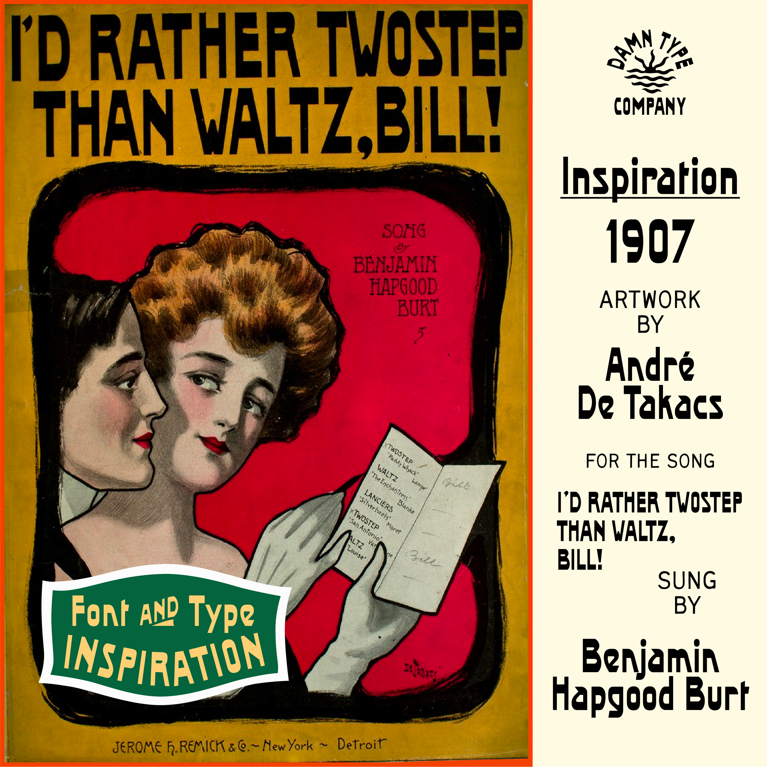 Image 15 of 16
 Image 16 of 16